The Project: Modernizing a 20-Year-Old Legacy Product
Our agency was contracted to modernize a title rates calculator for First American. This internal tool was used daily by roughly 10,000 of the company’s 60,000+ employees across the United States — some teams processing upwards of 3,000 quotes per week. The interface hadn’t been updated in over 20 years.
My Role
I led the design end-to-end with oversight from a design manager on the client side. There was no product manager — I owned the design direction, created an entirely new design language (the legacy design was not being carried forward), and coordinated with two front-end, and four back-end engineers.
Every two weeks, I presented to a panel of stakeholders who had managed the legacy tool for over a decade. They were deep domain experts, which meant I had to be thoroughly prepared and able to justify every design decision in their terms.
The Current State
While the front-end was being rebuilt from scratch, the back-end infrastructure had to stay. Multiple departments across the company depended on it, therefore every design decision needed to work within the constraints of a fixed system.
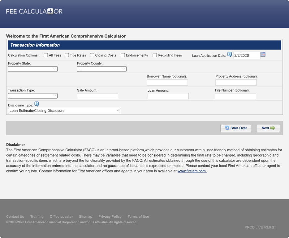
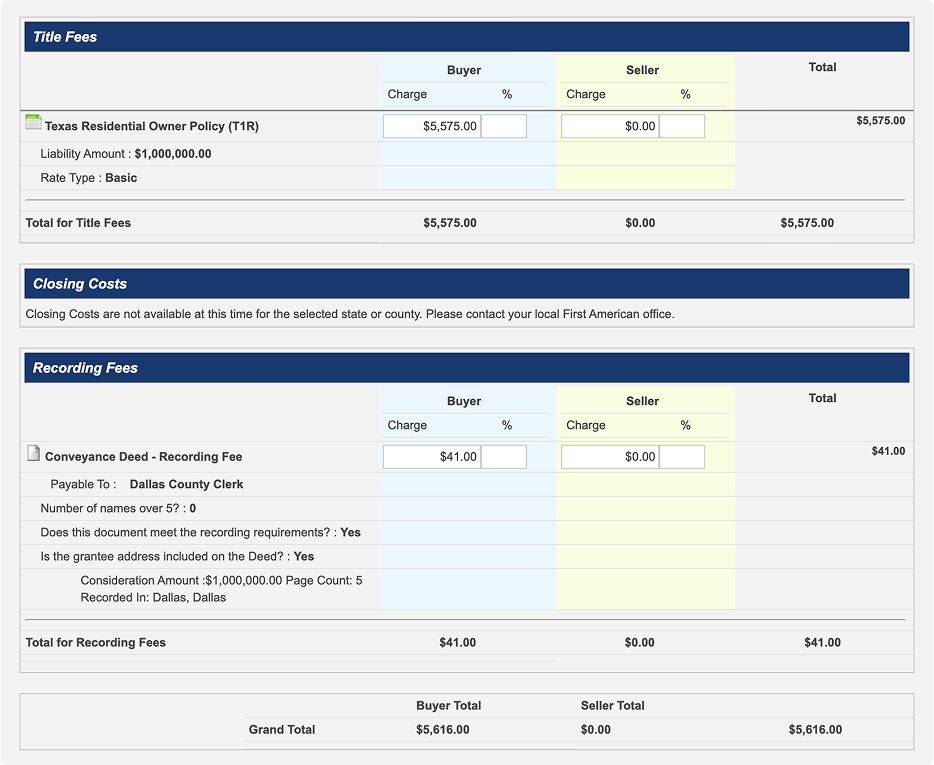
Here is the entry point of the existing calculator:
After completing the required fields, users reached this summary page showing costs and line items. The entire flow was linear and rigid.
Understanding the Current Workflows
I proposed a two-stage research approach. Phase one focused on understanding the pain points with the current system, and mapping the different use cases across the company. The client’s design manager wanted broad coverage, so we tested with roughly 80 participants spanning multiple departments and personas. Several patterns emerged quickly.
Linear Workflows Aren’t Flexible
The existing tool enforced a rigid, linear progression. This likely simplified the system’s architecture, but it came at a significant cost to the user experience.
Constrained and Rigid Processes
Because users couldn’t navigate between stages, any modification was painful. If you had 90% of your quote filled out and needed to change one field, you had to start over. If you returned later to make an edit, you were starting from scratch again. For teams processing thousands of quotes weekly, this was a massive time sink.
Why We Were Brought In
The problems were clear, which made the goal clear: build a flexible, modern front-end on top of a rigid, legacy back-end — without disrupting the infrastructure that the rest of the company depended on.
Opportunity: Build a Flexible System for Everyone
Phase two of our research used Figma prototypes built around realistic scenarios. Participants attempted to complete each scenario while thinking aloud, flagging friction points as they went.
1
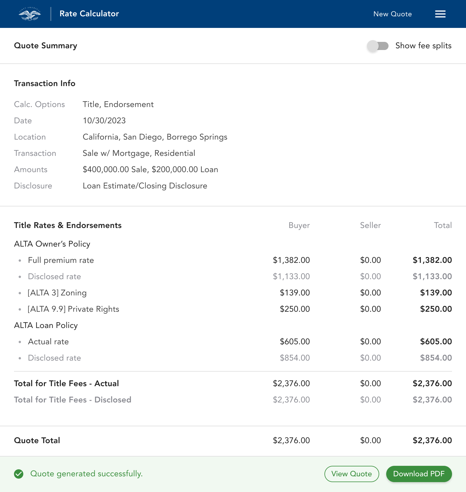
Users should understand that the left side of the interface where they input data, influences the right side that is generating their quote as they go.
2
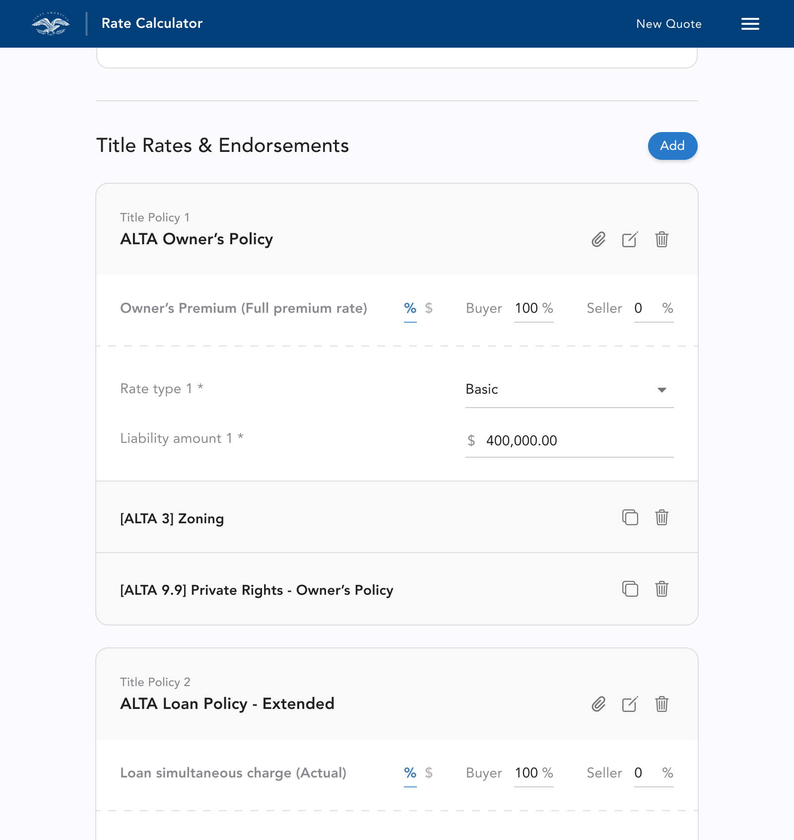
They should understand they can add, duplicate, delete and edit any of the items they are adding to their quote.
3
They should understand what state the app is in; if there is an error, if they are able to update their quote, and when their quote is updated and ready to export.
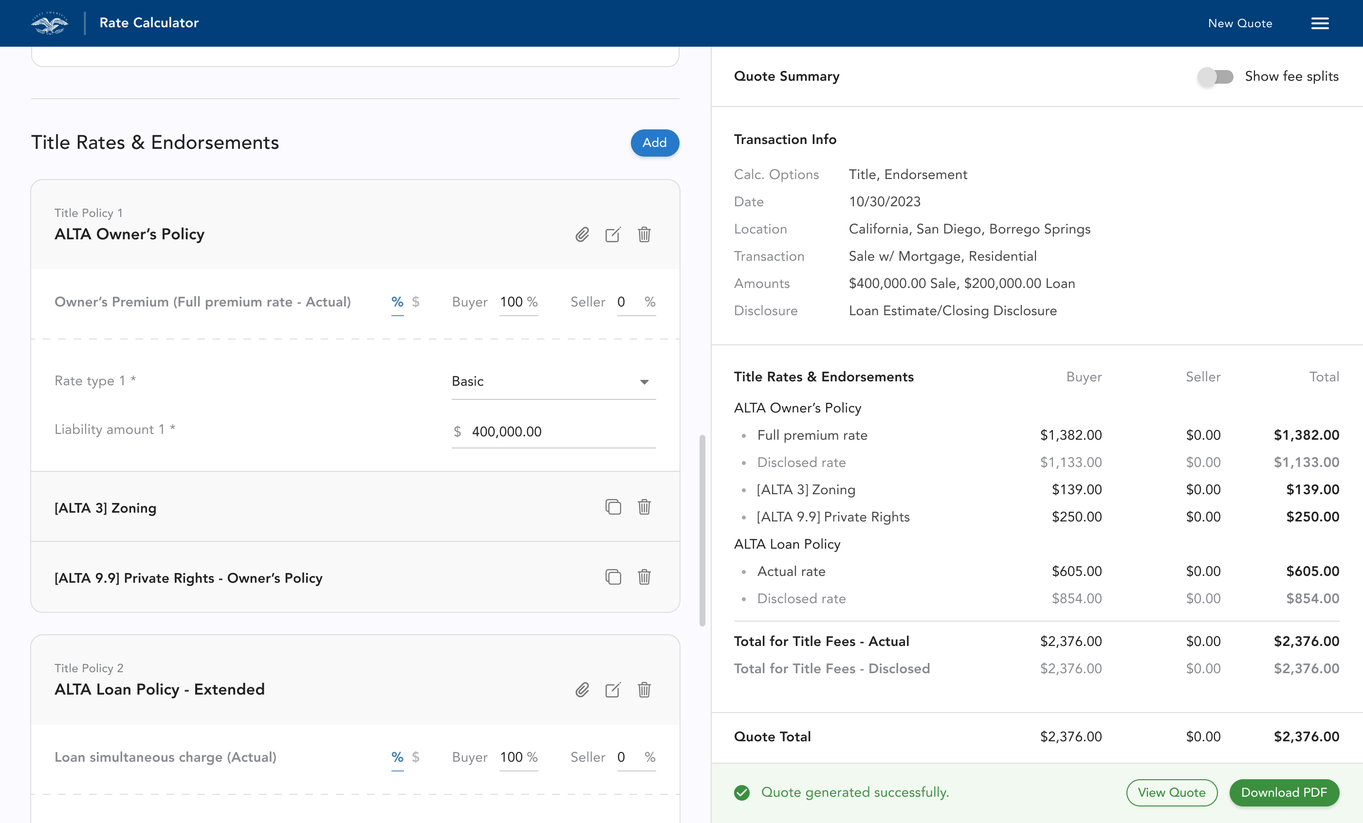
This is the design after our third round of testing and iteration:
Outcome: People Couldn’t Wait to Try the New App
Many of our test participants were power users who relied on this calculator daily. They told us how much faster their processes would be, and how excited they were to no longer have to start over in order to make changes. The ability to modify quotes on the fly, and make changes freely was a fundamental shift from the tool they’d been using for years.
Our testing sessions were a clear success, and we received full approval from the stakeholder panel to move into development.
Designing Around a Legacy Backend
My initial proposal was real-time quote updates — every user modification would immediately recalculate. However, First American’s backend regenerated the entire quote on each update, not just the modified section. This made automatic updates too expensive.
This constraint forced a different approach: I designed a system where users explicitly choose when to update. This meant the interface had to clearly communicate when an update was needed, what had changed, and that everything was current.
State Management
I designed a state management system with four distinct states: update required, error, warning, and up-to-date. Each state appeared both at the app level, and on individual line items; users could see exactly which parts of their quote needed attention and what would change when they triggered an update.
The Full System
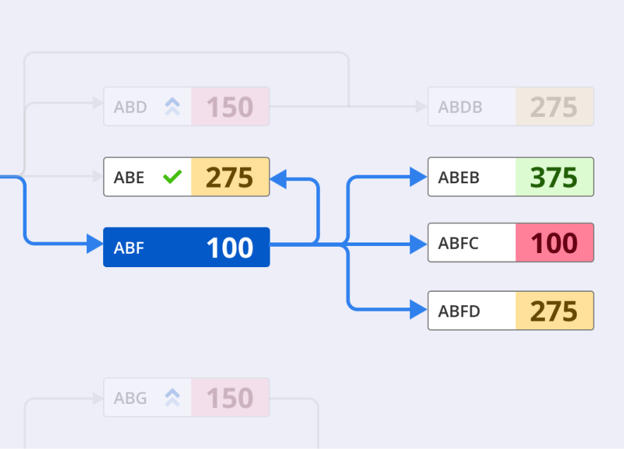
I produced workflow diagrams like the one below, to align both the stakeholder panel and the engineering team on how the system would behave in every scenario. These artifacts became essential references during our biweekly presentations and engineering handoffs.
Summary
The final design received full approval from the stakeholder panel — a group of domain experts who had managed this tool for over a decade and knew its intricacies inside out. They were excited to ship what we had built.
I was contracted to design the core product, and work with engineering to deliver an MVP. By the time my engagement ended, I had delivered a complete design system, a fully functional MVP based on a validated prototype tested across 80+ participants, detailed workflow documentation, and a state management framework that resolved the tension between a modern flexible interface, and a rigid legacy backend.
